Monday, April 21, 2014

Adrian Arleo


Adrian Arleo is a sculptor who creates these very interesting sculptures of figures and animals. I actually found this artist back in high school when I was in my AP 3D Design class and had to email and artist and ask them questions about their work, so I emailed her and received a response. Her work is incredibly beautiful and strange. She is probably one of my favorite sculptors.


I really love her work with hands. I really love the idea of hands and what they can portray in a piece of art and she makes it very interesting. There's a lot of repetition in these works and I think it works very well with each piece. I don't think they would be quite as powerful or hold the same kind of meaning if there wasn't repetition or less of it.


She also combines nature with the figure a lot. She does this is a subtle way, even with the creepy human/bird sculpture. She left most of the body bird-like but only incorporated the human parts in a few places, leaving it both recognizable as a bird and a human.


http://adrianarleo.com/

Thursday, April 3, 2014

Ileana Hunter

Amy Lee Ultra Minimal Portrait by IleanaHunter

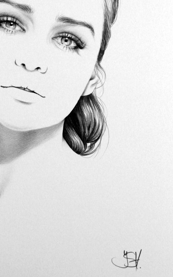
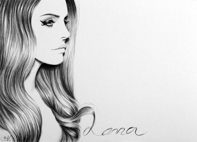
Illeana Hunter is a British illustrator. I came across her work and actually wasn't very impressed with her works. I feel like she has a lot of potential with her skills, but I don't really see a lot of artistic or creative talent with a lot of her pieces. I see it as basically just being able to draw well, but that doesn't necessarily mean that they are creative. She can clearly draw celebrities faces very well, but to me it just seems kind of boring and it lacks creativity.

Lady Gaga Minimal Portrait by IleanaHunter
It's interesting how she chooses to omit details and leave the skin pretty white, and basically gives the most attention to the eyes and lips. I don't really think this is a bad idea but on some of her works, it actually looks sort of incomplete. 


Emilia Clarke Commission - detail by IleanaHunterLady Gaga Commission by IleanaHunter

It kind of makes me wonder if she really wants it to look this way, or she thought it looked kind of neat to look incomplete or was too lazy(?) to do anything with the skin. I just don't really see the "art" in her works- it's drawing from a photo without adding any of your own ideas. 

Lana by IleanaHunter


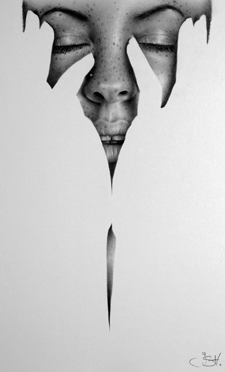
A lot of her works just seem like they were made for other people, not for herself. As in, for popularity, like to attract other people to look at her works simply because they recognize these people she draws. Even though I don't like most of her works, she clearly has some creativity because of a few of her pieces are not celebrity-based and these are the only works of her's I actually like.

Fragments by IleanaHunterLearn to Fly by IleanaHunter

http://ileanahunter.deviantart.com/

Wednesday, April 2, 2014

Anna Dittmann

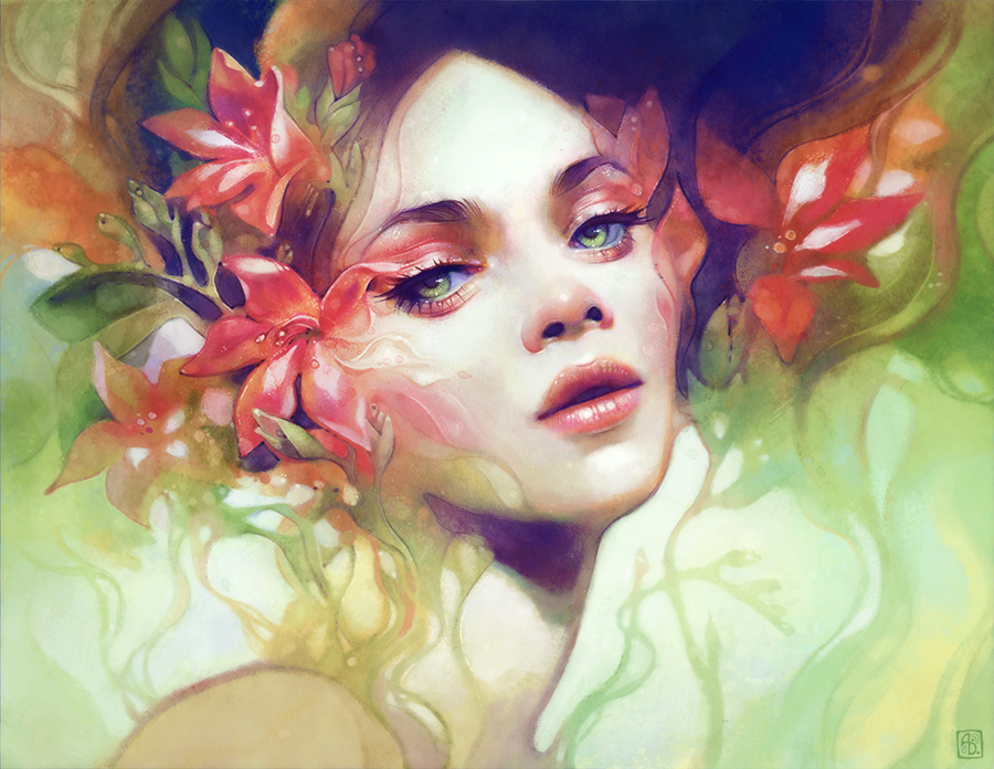
August by escume

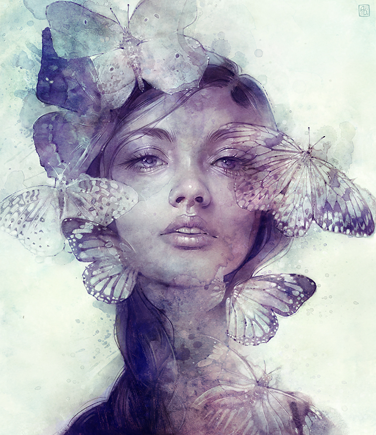
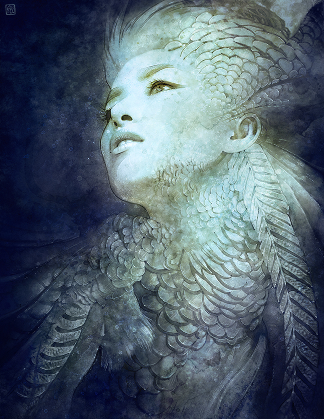
Anna Dittmann is digital artist from San Francisco. She does a lot of portraits and creates this sense of delicacy and beauty with each one. 

Crown by escume

The first thing I noticed about her paintings are that the colors are always very soft and I think it works incredibly well with her works. With the contrast between the sharpness of the details on the face and the softness and lack of small details in the rest, it makes the face the focal point, but isn't distracting from the rest of the piece. 

Adorn by escumeVein by escume

I also find it interesting how she tends to have her subject's face or eyes looking somewhere else. It kind of makes the painting feel a little disconnected and distant, which isn't a bad thing. Even though the piece is really beautiful, it's almost like a depressing or lost feeling of beautiful. 

Comb by escumeAmherst by escume


With some of her pieces, she uses fairly bright colors but its not so bright and contrasting where it looks strange. I think even with the colors, it still shares the same sort of feeling as the rest of her pieces. I also think she's very skilled in picking out colors that work well together, which is something not a lot of people are good at. 

August by escumeDecember by escume

February by escume


http://escume.deviantart.com/gallery/

RHADS

Speedpainting 56 by RHADS

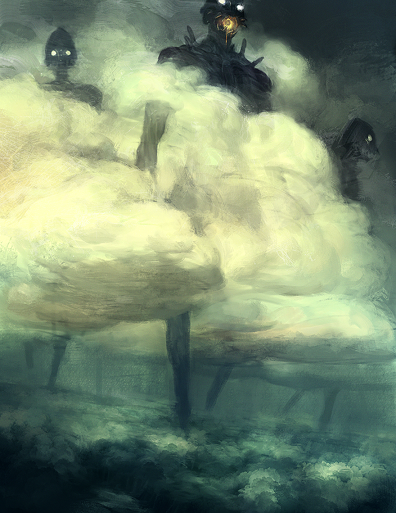
Rhads is a Russian digital artist that I found a while back and was always pretty fond of his work, especially his speed paints. Though the rest of his works are very beautiful and detailed, I was just drawn to these scenic paintings that were done only in a few hours or less than an hour.

Even though they look sort of messy, it's really fascinating to see how he chose to represent little details in quick strokes and colors. They aren't super clear either, but you can still tell what the image is and I think this almost abstract way of creating these landscapes can make them so much more interesting, since he doesn't focus on the little details, but the colors and shapes.
Speedpaint 59 Motley Grass by RHADSi can't leave you by RHADS

He also uses a lot of drastically different sizes brushes in the same areas. It creates this texture without spending so much time trying to create an exact replica.


Speedpainting 48 by RHADS

Speedpainting 33 by RHADS

I also really like the atmosphere he gives his paintings by using colors and perspective. Even with very hopeful and bright colors, he still manages to create a sense of isolation or emptiness in his works. There's usually something like a path that leads you into the image, and it seems like it just goes on forever. 

Speedpainting 34 by RHADS

Speedpainting 54 Ukok by RHADS


http://rhads.deviantart.com/gallery/45260655

Tuesday, April 1, 2014

Tobias Kwan

Motherland Chronicles #38 - rider by tobieegod warriors by tobiee

Tobias Kwan is a Canadian artist living in California. He is a concept artist for several video game companies. I really admire him and his work because he basically has a job I've always wanted. His work is also very beautiful and dark. 

Motherland Chronicles #36 - braid by tobieeMotherland Chronicles #32 - Stepper II by tobiee

Motherland Chronicles #15 - mother by tobieebald by tobiee

I really love the colors that he chooses. They are generally very dark and the lighting is very beautiful and not too distracting. A lot of his works also seem to tell some sort of story, or it makes you want to ask questions about what is happening or who the subjects are. 

arms by tobiee

He also utilizes contrast very well. He creates these beautiful paintings with clear focal points, but it doesn't distract too much from the rest of the painting. The colors aren't too saturated either which I really like. I love contrast but too much can be a bad thing, especially when not using the right colors, I think. 

I also noticed a lot of his works seem to have women who seem to have a lot of power. I find this very interesting because he does it in a way without over-sexualizing them to create this dominance. I think he does this by using proper lighting and drawing these characters in a specific position that gives off this strength. 


Motherland Chronicles #18 - bunny yaga by tobiee

Motherland Chronicles #14 - nest head by tobiee

Motherland Chronicles #3 - flower stomper by tobiee


http://tobiee.deviantart.com/gallery/

Kaori Sakai

Encounter by kaori125
"Encounter"

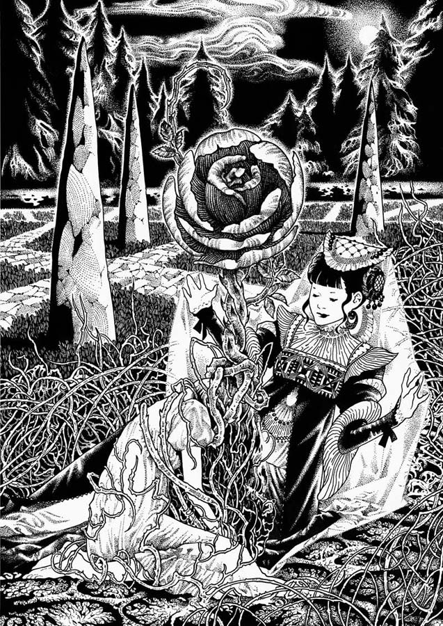
Kaori Sakai is a Japanese artist who tends to use a lot of watercolors and inks. I was drawn to her art because it was really creepy and it reminded me a lot of one of my favorite artists, Junji Ito. She creates these very lonely and dark looking paintings and illustrations that would probably make most people feel a little uncomfortable. 

portrait by kaori125LAdy by kaori125

Twilight by kaori125Festival by kaori125

I really love the colors that she uses in a lot of her works because they are very muted and dark, but it doesn't look boring or dull. The colors she chooses fit extremely well with the mood she is trying to accomplish. Even with using so few colors, she still manages to create defined details and uses the different tones to her advantage.

Watcher by kaori125The Black Egg by kaori125

She also does some ink works which are really impressive. There are so many details and a lot going on. But it doesn't feel too busy because of the lack of other colors besides black/white. 

Carmilla by kaori125trees by kaori125

I just really love how she incorporates a sense of horror without directly showing it. I feel like she shows fear, or anxiety, or even narcissism in a subtle way. It's just incredibly dark and somewhat mysterious. I don't really have a lot of information on this artist, which is both strange and interesting at the same time. While I love learning about artists I really like, I for some reason also love these unknown artists that have very little information about themselves and the meaning behind some of their pieces are not explained and it's up to you to figure out what they were trying to say.

http://kaori125.deviantart.com/gallery/