Thursday, April 24, 2014

Johannes Voß

MtG: Gift of Orzhova by algenpfleger

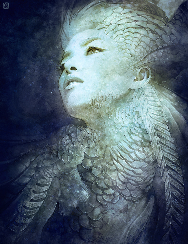
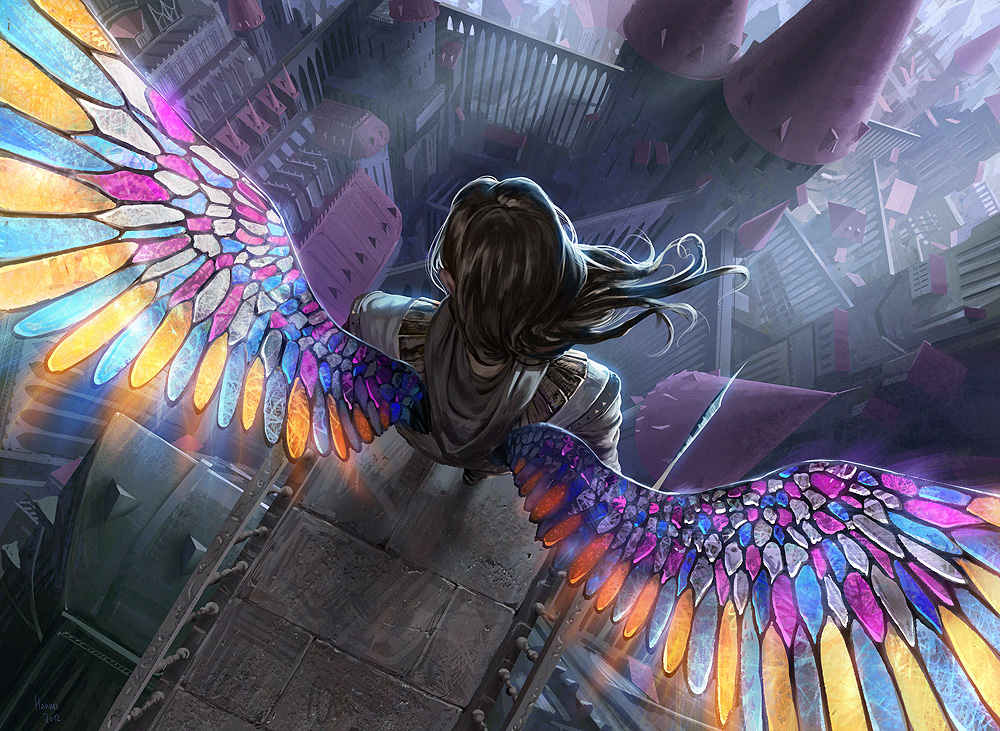
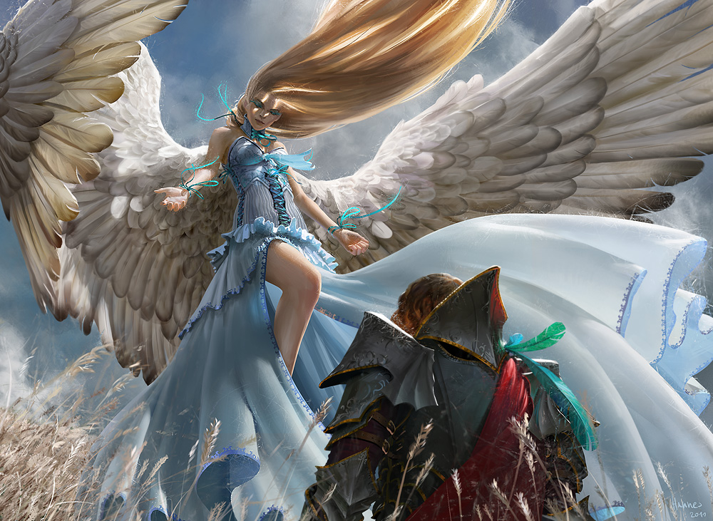
Johannes Voß/algenplfeger is a German digital artist. I found this artist a while back and was really impressed by the way he could create these intense and beautiful scenes. There always seems to be some kind of movement in his pieces and they have this powerful feeling. 

MtG: Blood Artist by algenpfleger

drink up me hearties by algenpfleger

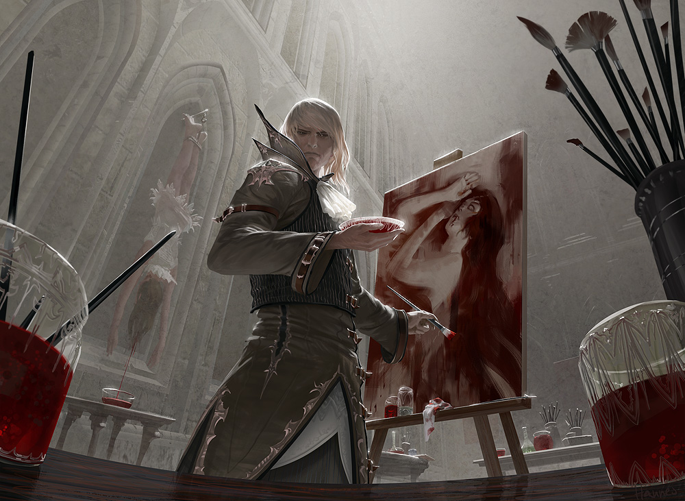
Each piece looks like it has a story to it, or a quick pause in a scene. The way he uses color is also really amazing as well. He uses contrast in some of his darker pieces and he uses it very well. It helps with the tone he may be trying to create and the importance of some of the objects in the painting. 

On the Earth by algenpfleger

I noticed that he also tends to use characters with wings or angel-like people.  I think he does this in a very beautiful way. He creates this movement with the wings and it feels very overpowering, but in a good way. 

MtG: Restoration Angel by algenpfleger

Archangel by algenpfleger

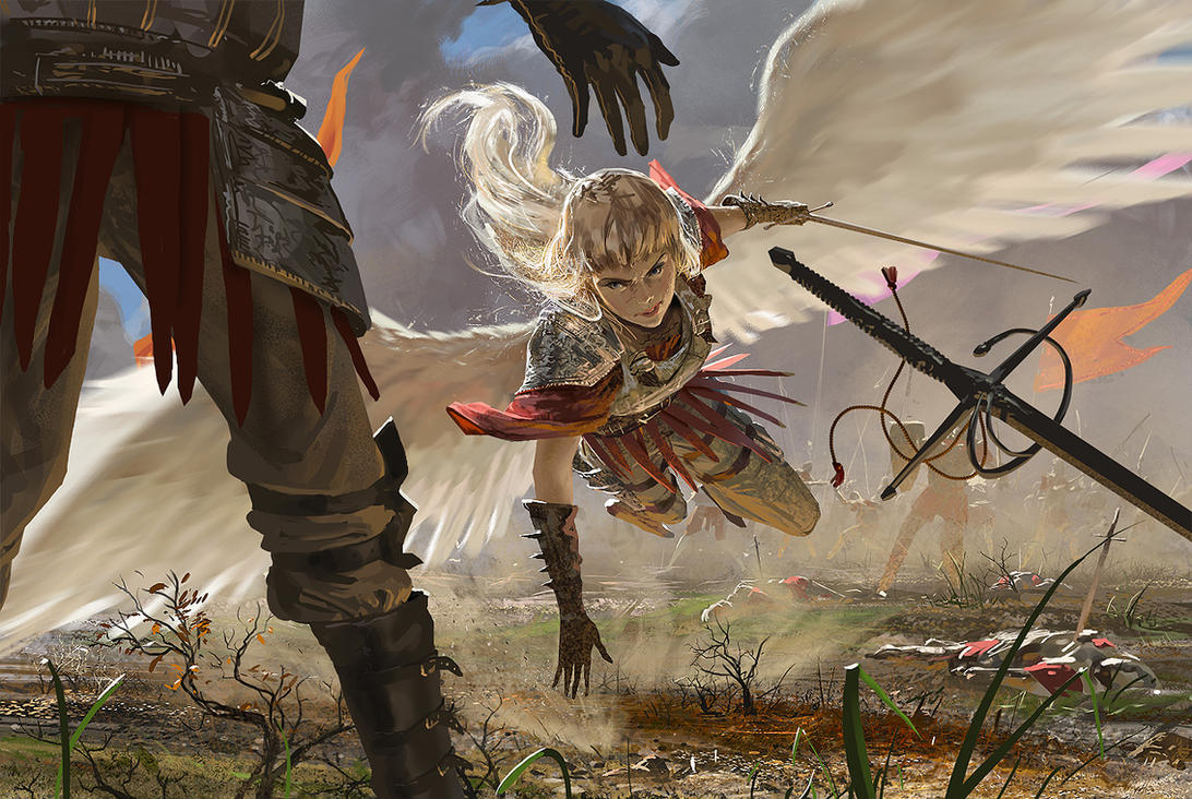
I think he also chooses very interesting perspectives and creates a flawless scene from these different views. 

Well Wishes by algenpfleger

http://algenpfleger.deviantart.com/

Wednesday, April 23, 2014

Jeff Simpson

janus

Jeff Simpson is a digital artist who creates these almost surreal and fantasy-like paintings. I've always really loved his work and how he creates this actual paint-like look and texture.

brut

mermaid

I really love the colors he chooses because they are so muted and it creates this dark feeling to each one of his works, even though the image itself may not be very dark or unpleasant looking. 

kudulilith

Its also kind of interesting how he seems to choose female subjects more often than males. I'm not sure if this is intentional or not, but it would actually be kind of neat to see a mixture of both males and females. Though I sort of think that possibly the intention of some of his pieces could be showing the darker and messed up side of some females that you don't really see. That or he just really likes drawing females. 

He also does concept work for a video game series I really love: Assassin's Creed. 

ezio2

It's really fascinating to see the concept art behind characters from games, especially since it's not always just a replica of a 3D model. I really love looking at concept art since you can compare the piece to what you actually see in the game and how it differs. 

cityLife

http://jeffsimpsonkh.deviantart.com/
http://www.surrealsushi.com/

Tuesday, April 22, 2014

Eadweard Muybridge/3 artists who work with time


Gerhard Richter


He uses this method of blurring photographs to create the sense of time passing- like the subject themselves were moving while the photograph was taken. I think this is actually really interesting- although the way he executes it isn't exactly the way I would do it, I like the general idea and I may use this technique in my project.


Salvador Dali

He uses time in his work in almost a literal sense- he displays the passage of time as clocks melt and deform- like changing time or distorting it. His works are very surreal which I think make a good way to display time since time isn't really something you can physically see or feel and only really exists to humans.


Pieter Claesz's

I think he displays time in a slightly non-direct manner. He shows these aged objects along with new ones. The skull and melted candle sort of show the passage of time in the form of decaying or dying. If this was a real scene, you would know that time had passed simply because of the candle. 


Monday, April 21, 2014

Adrian Arleo


Adrian Arleo is a sculptor who creates these very interesting sculptures of figures and animals. I actually found this artist back in high school when I was in my AP 3D Design class and had to email and artist and ask them questions about their work, so I emailed her and received a response. Her work is incredibly beautiful and strange. She is probably one of my favorite sculptors.


I really love her work with hands. I really love the idea of hands and what they can portray in a piece of art and she makes it very interesting. There's a lot of repetition in these works and I think it works very well with each piece. I don't think they would be quite as powerful or hold the same kind of meaning if there wasn't repetition or less of it.


She also combines nature with the figure a lot. She does this is a subtle way, even with the creepy human/bird sculpture. She left most of the body bird-like but only incorporated the human parts in a few places, leaving it both recognizable as a bird and a human.


http://adrianarleo.com/

Thursday, April 3, 2014

Ileana Hunter

Amy Lee Ultra Minimal Portrait by IleanaHunter

Illeana Hunter is a British illustrator. I came across her work and actually wasn't very impressed with her works. I feel like she has a lot of potential with her skills, but I don't really see a lot of artistic or creative talent with a lot of her pieces. I see it as basically just being able to draw well, but that doesn't necessarily mean that they are creative. She can clearly draw celebrities faces very well, but to me it just seems kind of boring and it lacks creativity.

Lady Gaga Minimal Portrait by IleanaHunter
It's interesting how she chooses to omit details and leave the skin pretty white, and basically gives the most attention to the eyes and lips. I don't really think this is a bad idea but on some of her works, it actually looks sort of incomplete. 


Emilia Clarke Commission - detail by IleanaHunterLady Gaga Commission by IleanaHunter

It kind of makes me wonder if she really wants it to look this way, or she thought it looked kind of neat to look incomplete or was too lazy(?) to do anything with the skin. I just don't really see the "art" in her works- it's drawing from a photo without adding any of your own ideas. 

Lana by IleanaHunter


A lot of her works just seem like they were made for other people, not for herself. As in, for popularity, like to attract other people to look at her works simply because they recognize these people she draws. Even though I don't like most of her works, she clearly has some creativity because of a few of her pieces are not celebrity-based and these are the only works of her's I actually like.

Fragments by IleanaHunterLearn to Fly by IleanaHunter

http://ileanahunter.deviantart.com/

Wednesday, April 2, 2014

Anna Dittmann

August by escume

Anna Dittmann is digital artist from San Francisco. She does a lot of portraits and creates this sense of delicacy and beauty with each one. 

Crown by escume

The first thing I noticed about her paintings are that the colors are always very soft and I think it works incredibly well with her works. With the contrast between the sharpness of the details on the face and the softness and lack of small details in the rest, it makes the face the focal point, but isn't distracting from the rest of the piece. 

Adorn by escumeVein by escume

I also find it interesting how she tends to have her subject's face or eyes looking somewhere else. It kind of makes the painting feel a little disconnected and distant, which isn't a bad thing. Even though the piece is really beautiful, it's almost like a depressing or lost feeling of beautiful. 

Comb by escumeAmherst by escume


With some of her pieces, she uses fairly bright colors but its not so bright and contrasting where it looks strange. I think even with the colors, it still shares the same sort of feeling as the rest of her pieces. I also think she's very skilled in picking out colors that work well together, which is something not a lot of people are good at. 

August by escumeDecember by escume

February by escume


http://escume.deviantart.com/gallery/

RHADS

Speedpainting 56 by RHADS

Rhads is a Russian digital artist that I found a while back and was always pretty fond of his work, especially his speed paints. Though the rest of his works are very beautiful and detailed, I was just drawn to these scenic paintings that were done only in a few hours or less than an hour.

Even though they look sort of messy, it's really fascinating to see how he chose to represent little details in quick strokes and colors. They aren't super clear either, but you can still tell what the image is and I think this almost abstract way of creating these landscapes can make them so much more interesting, since he doesn't focus on the little details, but the colors and shapes.
Speedpaint 59 Motley Grass by RHADSi can't leave you by RHADS

He also uses a lot of drastically different sizes brushes in the same areas. It creates this texture without spending so much time trying to create an exact replica.


Speedpainting 48 by RHADS

Speedpainting 33 by RHADS

I also really like the atmosphere he gives his paintings by using colors and perspective. Even with very hopeful and bright colors, he still manages to create a sense of isolation or emptiness in his works. There's usually something like a path that leads you into the image, and it seems like it just goes on forever. 

Speedpainting 34 by RHADS

Speedpainting 54 Ukok by RHADS


http://rhads.deviantart.com/gallery/45260655