Tuesday, May 6, 2014

Muybridge Artist Statement

Your Withered Heart, and Everything it's Seen

This piece was really different for me, especially since I'm not used to photographing my own work and relying on both my sculpture skills and my photography skills for this to work and look acceptable. This project was really a challenge since I had done nothing like this before.
I started out with a different idea than what I have now, but I think I'm fairly happy with the results. I wanted to create an implied sense of time by showing decay and telling a story at the same time. Time passes throughout stories and movement and I thought I should strengthen this idea by creating actual decay on the pages of the story. The story itself it sort of about decay and obsession and how they go along with each other. I personally find decay beautiful so I wanted to incorporate that as my idea of time. I also didn’t want to include words in my story because I feel like the story could be taken several different ways and I wanted the story to be up to the viewer and how they interpret not only the photographs, but the gradual decay of the pages as well.
It took a really long time for me to figure out how to physically display this piece, and decided that since I’m telling a story through photographs, I should create a book-like format for it.
Overall, I’m fairly happy with the results. There are a few things I wish I had done differently in the construction but I didn’t really plan it out that well and didn’t think ahead.

Muybridge Life/work/inspiration


Eadweard Muybridge was born in Thames, England back in 1830 and seemed to have a fairly regular childhood. As an adult, he eventually moved to America where he acquired a few jobs and discovered his interest in photography. 
Over time, he finally landed a job in 1872 to determine whether all four of a horse's hooves were in the air at the same time as it was running. He at first used 12 different cameras to capture the same movement at different times and locations. It took him nearly 8 years to perfect this capture and found that all four hooves did indeed leave the ground at the same time while running. 
Muybridge continued working with photographing animals and humans and their movements. As an already known photographer, he published and sold books and taught his methods around the world. 

His works were mainly focused on movement, or movement over time. He created motion with still photos which seemed to be pretty different and original at the time. It seems like his inspiration first came from his job with the horse and was interested in frame-by-frame movement ever since. 


Source:
"Eadweard Muybridge." 2014. The Biography.com website. May 06 2014http://www.biography.com/people/eadweard-muybridge-9419513.

Saturday, May 3, 2014

Anne Frank Memorial

1. Describe what you see, including location (context) and physical space.
It's pretty open and spacious. There's not a lot of nature direction on/in the memorial site. Though its spacious, it still feels kind of close and not too open where it feels very empty. The seating type area kind of makes it feel more close, yet it does create a feeling of emptiness since no one is sitting on them most of the time. 

2. Describe the varying degrees of representation.
I don't feel like the representation of the memorial is supposed to be very aesthetically pleasing or artistic/creative looking because its pretty plain with the exception of the sculpture of Anne Frank. I don't see any other way you could look at it and see something wildly creative or something. It's mostly just about the words/quotes and history. 

3. What are visual elements/principles that dominate in the memorial?
Space, color, shape/form. There's varying forms of space and closeness of objects to one another. It's noticeably pretty spacious, yet closed off because of the wall-like stones surrounding certain parts of the memorial. The colors are pretty neutral, there's not a wide variety of colors. I think if it were more colorful, it would create a different feeling when you walked into the memorial and it might take away some of the historical value. The area is also pretty circular and round, the seats are shaped like a dome and the walls surrounding the area are as well. 

4. Is this memorial "site-specific"?  Explain.
I'm not really sure. I don't really understand why it was put here, but it seems like it belongs here. The architecture sort of fits in with the rest of the area around the memorial. 

5. Who created, designed and funded this memorial? 
Boise Parks and Recreation, the community, Idaho Human Rights Education Center, and the Boise Council.

6. What materials/media were used to create this memorial? 
Some sort of stone, I'm not really sure. There's not a lot of different materials used besides the sculpture of Anne Frank which looks like some kind of metal. 

7. How does the text/word elements function?
They give a more informational feeling rather than artistic feeling. 

8. Reflection on your answers to the previous questions, what do you think was the intended meaning/function? Explain what is communicated.
To educate people and especially children about human rights, equality and history. 

9. In your opinion, how successful is this memorial? Explain.
At first I wasn't really that impressed because I just thought it would be about Anne Frank and WW2, but it turned out to be pretty different than what I had thought. I also didn't know how big the area was until I started walking around. I think also by not making the memorial entirely historical and making it more about teaching and educating people about human rights it feels like it can appeal to more people by also making it more personal. 

Transformation Artist Statement


Kings

When first starting this piece I was excited to work on it. I did not think much about what material I wanted to use because band-aids stuck out a lot for me. It was an object I was very familiar with and knew that it portray a deeper idea than another material might have. Hands are very beautiful to me and like the material, can represent something just by being itself. I also like the connection between a hand and a bandage, since bandages are generally skin-colored like they are attempting to be unseen, or to make something not noticeable.
The function of the band-aids has changed in this piece, which was my goal. They are used to hide, fix, and cover rather than heal and protect.
I tried to work line into my piece because it was lacking something interesting or eye-catching. This entire process was an experiment and nothing was pre-planned. I regret not thinking more about the construction of this piece because I am not proud of it. I added the pills to hopefully create something interesting, but it turned out looking messy. There’s clearly some meaning behind it, it just did not come out the way I had hoped. 

Friday, May 2, 2014

Axel Torvenius

'Ferni' - midget sculpture by torvenius

Axel Torvenius is a Swedish artist who does a variety of works but I find his sculptures to be my favorite and most interesting.

He tends to work with a lot of dark and creepy images and ideas which I really love. The way he uses the unproportional bodies with long, thin limbs makes it feel more like a monster and something you should be scared of because it lacks normal human qualities. Even with the skull, it isn't a complete human skull which I find really interesting looking. I think this artist really understands creepy. 

Fetchin - Little Black Angel by torvenius

He also does a series of masks which are also creepy/gross. 

Mask - Vagina Dentata by torvenius
Mask - 'Shark Grin' by torvenius
New mask - 'Accident 01' by torvenius

The decayed look of the mask in combination with the teeth and openings really make you wonder about the idea of a mask. They almost look like a person wearing some kind of mask, instead of the entire piece being a mask. The craftsmanship also looks incredible and I really wish I could see one of these in person.

"Unwanted with teeth tummy" by torvenius"Unwanted Prince" by torvenius
"Unwanted and black ribcage" by torvenius

http://torvenius.deviantart.com/
http://www.torvenius.com/master.php?header=header_sculpture.htm&body=body_blank.htm


Hoooook

.. by hoooook

Hoooook is a Korean digital artist. I first saw one of his pieces online and was instantly drawn to his work. He creates these almost fantasy-like paintings that are simple yet incredibly beautiful. 

Cordyceps militaris by hoooook 
.. by hoooook

He creates these intense, yet soft looking pieces. He does a lot of with color as well, which certainly helps his works. He tends to choose 1 or 2 colors and work them into the painting, leaving a certain feeling in his works. 

I also really love that he works in such a large scale. When you zoom in on his paintings they are very large and you can see the little workings and details he's added. I love being able to see brush strokes and such.
In this painting below, there is a lot more detail and it looks very beautiful up close. Which is strange because normally paintings up close look pretty bad, or at least not better than far away. I just really love the textures he uses with his brushes. It creates a very natural feeling to the piece.

 -5-4 by hoooook

.. by hoooook007 by hoooook


http://hoooook.deviantart.com/
http://blog.naver.com/hoooook

Dave Palumbo

Fed by davepalumbo
Dave Palumbo is an illustrator and painter who does these very beautiful and dark pieces. 
I noticed a lot of his pieces relate to death which I find to be very interesting. Or at least he seems to involve skeletons or skulls in a lot of his paintings. 

Unknowable by davepalumboThey Are All Equal Now by davepalumbo

The Clearing by davepalumboTranscend by davepalumbo

Some of these paintings make me think of conquering death or letting death conquer you, or become a part of you. I feel like there is a lot of meaning behind these paintings and it's very fascinating to try to decipher them. 
I really love the dull colors as well- they give that melancholy and somewhat powerless yet also powerful feeling. 

Like this image below, you can look at it two ways: either defeating "death" or the skull, or the skull is being destroyed/stepped on by a person and being defeated. It's interesting how the meaning of the painting can sort of change based on the perspective of the objects. 
Human Frailty by davepalumbo

Ivory Wings by davepalumboTaken by davepalumbo

As stated before, I just really love the colors he chooses. They tend to be this grayish color mixed in with a subtle or somewhat bright orangish/redish color. It creates some contrast but not so much that its distracting. I feel like without even realizing this color scheme he uses, I still felt this sense of hostility. He does a fantastic job with colors to create a specific mood/tone.


http://davepalumbo.deviantart.com/
http://www.dvpalumbo.com/

Thursday, April 24, 2014

Johannes Voß

MtG: Gift of Orzhova by algenpfleger

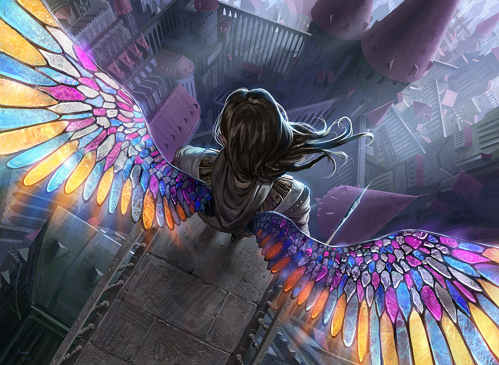
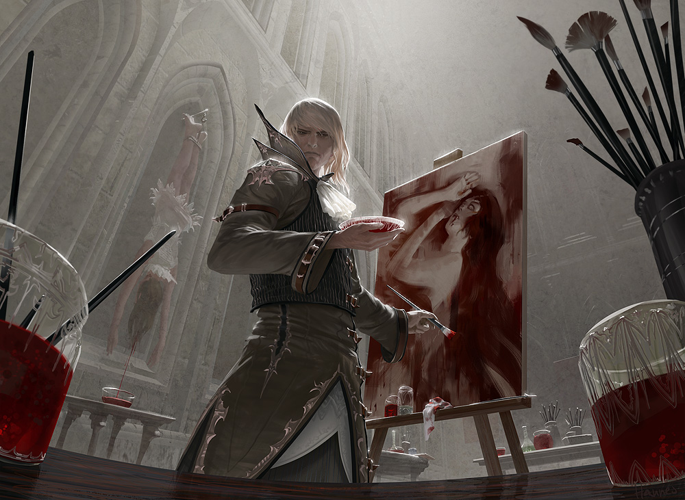
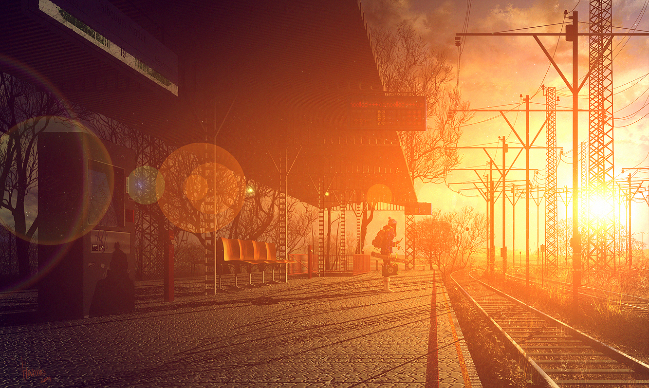
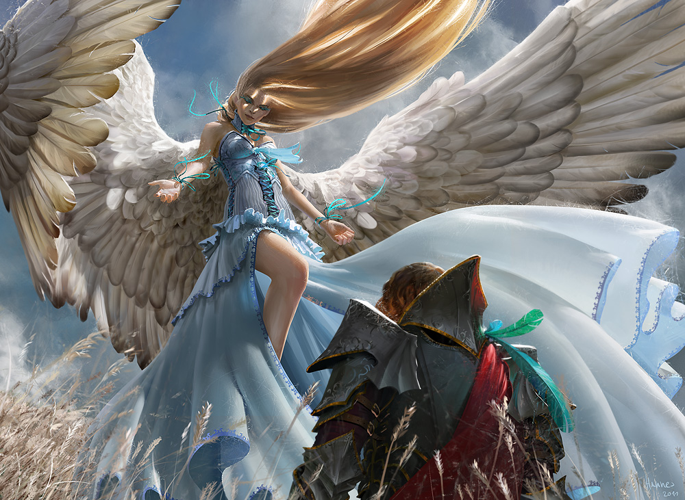
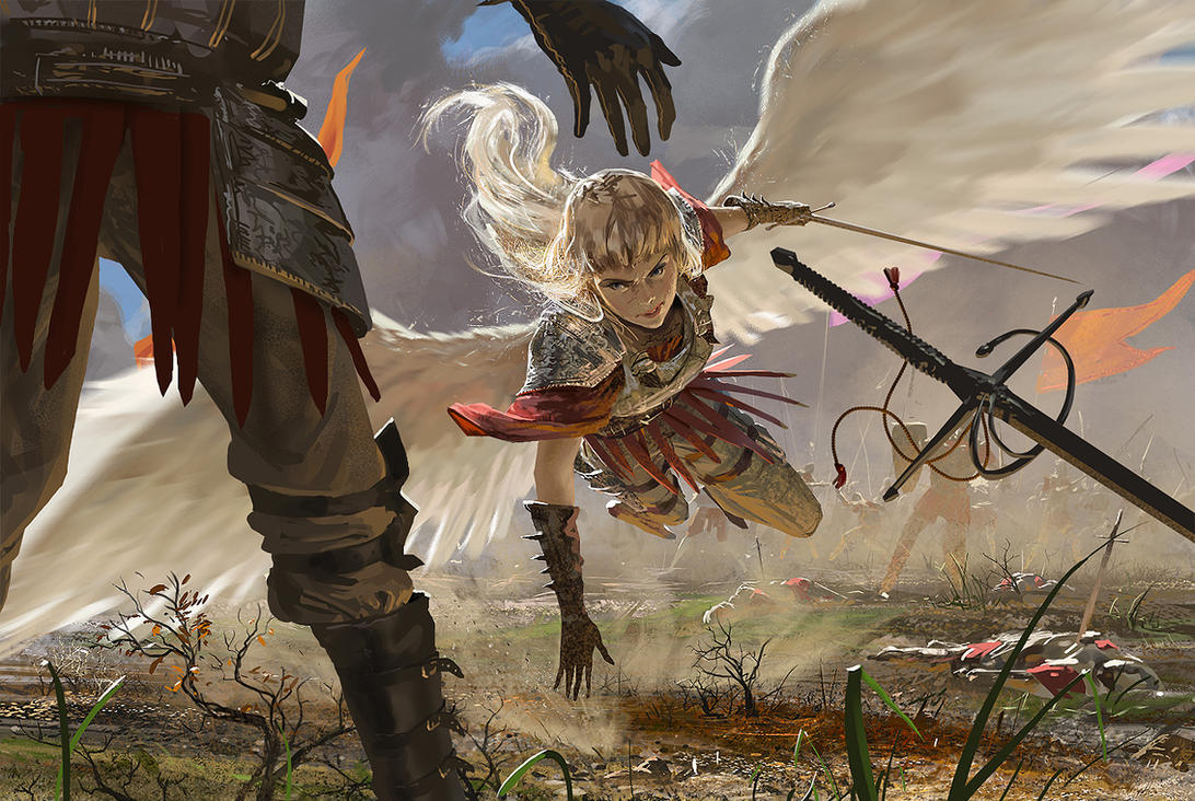
Johannes Voß/algenplfeger is a German digital artist. I found this artist a while back and was really impressed by the way he could create these intense and beautiful scenes. There always seems to be some kind of movement in his pieces and they have this powerful feeling. 

MtG: Blood Artist by algenpfleger

drink up me hearties by algenpfleger

Each piece looks like it has a story to it, or a quick pause in a scene. The way he uses color is also really amazing as well. He uses contrast in some of his darker pieces and he uses it very well. It helps with the tone he may be trying to create and the importance of some of the objects in the painting. 

On the Earth by algenpfleger

I noticed that he also tends to use characters with wings or angel-like people.  I think he does this in a very beautiful way. He creates this movement with the wings and it feels very overpowering, but in a good way. 

MtG: Restoration Angel by algenpfleger

Archangel by algenpfleger

I think he also chooses very interesting perspectives and creates a flawless scene from these different views. 

Well Wishes by algenpfleger

http://algenpfleger.deviantart.com/

Wednesday, April 23, 2014

Jeff Simpson

janus

Jeff Simpson is a digital artist who creates these almost surreal and fantasy-like paintings. I've always really loved his work and how he creates this actual paint-like look and texture.

brut

mermaid

I really love the colors he chooses because they are so muted and it creates this dark feeling to each one of his works, even though the image itself may not be very dark or unpleasant looking. 

kudulilith

Its also kind of interesting how he seems to choose female subjects more often than males. I'm not sure if this is intentional or not, but it would actually be kind of neat to see a mixture of both males and females. Though I sort of think that possibly the intention of some of his pieces could be showing the darker and messed up side of some females that you don't really see. That or he just really likes drawing females. 

He also does concept work for a video game series I really love: Assassin's Creed. 

ezio2

It's really fascinating to see the concept art behind characters from games, especially since it's not always just a replica of a 3D model. I really love looking at concept art since you can compare the piece to what you actually see in the game and how it differs. 

cityLife

http://jeffsimpsonkh.deviantart.com/
http://www.surrealsushi.com/

Tuesday, April 22, 2014

Eadweard Muybridge/3 artists who work with time


Gerhard Richter


He uses this method of blurring photographs to create the sense of time passing- like the subject themselves were moving while the photograph was taken. I think this is actually really interesting- although the way he executes it isn't exactly the way I would do it, I like the general idea and I may use this technique in my project.


Salvador Dali

He uses time in his work in almost a literal sense- he displays the passage of time as clocks melt and deform- like changing time or distorting it. His works are very surreal which I think make a good way to display time since time isn't really something you can physically see or feel and only really exists to humans.


Pieter Claesz's

I think he displays time in a slightly non-direct manner. He shows these aged objects along with new ones. The skull and melted candle sort of show the passage of time in the form of decaying or dying. If this was a real scene, you would know that time had passed simply because of the candle. 


Monday, April 21, 2014

Adrian Arleo


Adrian Arleo is a sculptor who creates these very interesting sculptures of figures and animals. I actually found this artist back in high school when I was in my AP 3D Design class and had to email and artist and ask them questions about their work, so I emailed her and received a response. Her work is incredibly beautiful and strange. She is probably one of my favorite sculptors.


I really love her work with hands. I really love the idea of hands and what they can portray in a piece of art and she makes it very interesting. There's a lot of repetition in these works and I think it works very well with each piece. I don't think they would be quite as powerful or hold the same kind of meaning if there wasn't repetition or less of it.


She also combines nature with the figure a lot. She does this is a subtle way, even with the creepy human/bird sculpture. She left most of the body bird-like but only incorporated the human parts in a few places, leaving it both recognizable as a bird and a human.


http://adrianarleo.com/