Tuesday, March 25, 2014

Ryohei Hase


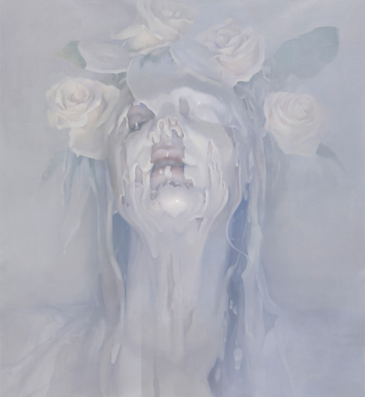
Ryohei Hase is a Japanese digital illustrator. His way of describing his works is, "My theme of paintings is to express the darkness of mind which is sad and gloomy but at the same time, it's beautiful and strong." I think this is worded pretty well and seems accurate from the way his pieces look. I think the way he describes this is quite beautiful, because I also find it to be very true.


He adds enormous amounts of detail to his works. When I first saw this painting, I didn't see all the little things at first. But the closer you look, the more details you start finding and it's really fascinating how as you discover these little things, it creates a different feeling in the piece.

Detail:


Suddenly Appeared Out of Nowhere by Ryohei-Hase
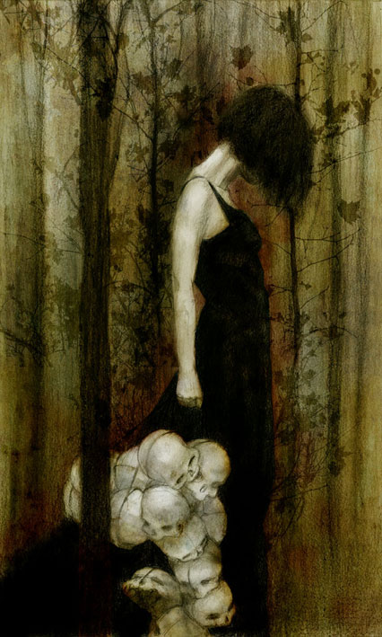
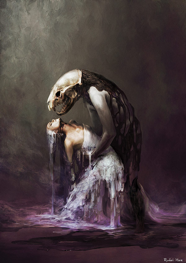
I really love how he uses color in his pieces. Especially like the one above. It's a very dark and sad looking image, but the colors make it very beautiful and delicate-looking. It changes that feeling from not just dark, but also inspiring. Though this piece would still look very good without all the colors, it gives a different tone to the viewer when there is this strange combination and abundance of colors. I also really enjoy the moment in this piece- the skeleton and the person seem to be moving different directions, and you are just viewing their short involvement with each other in possibly this small, split-second moment. 

TAYUTAU by Ryohei-Hase

Loss of Speech Stage by Ryohei-Hase

His only wish was to touch by Ryohei-Hase

http://ryoheihase.com/

Friday, March 21, 2014

Ivan Alifan


Ivan Alifan is a Russian painter who creates these very beautiful works of subjects covered in white paint. It's a very strange idea, but the way it turns out is not exactly what you would expect. He transforms this into something delicate, or something that is a bit frightening. It almost looks like the subject's skin is melting. I love that he choose white for his paintings because it's very neutral, but at the same time can mean something completely different than black. By using, white it looks almost pure or clean, even though the person may look distressed.

Sugar Babe by alifannUntitled by alifann

Though he does use white a lot, the use of lighting also changes the feeling of the painting. By using warmer colors, like in the one above on the left, it almost feels inviting and peaceful. On the other hand, the one on the right has a mixture of warm and cool colors which gives this strange feel of welcoming, but also fear or anxiety. 

Ceramic Skin by alifannObedient Wife by alifann

Porcelain Skin by alifann


http://www.ivanalifan.com/

Tommy Richardsen


Tommy Richardsen is a Norwegian photographer who focuses mostly on shooting the northern lights in Norway. I've always loved this strange phenomenon and it's really beautiful the way he captures the lights, along with the landscape beneath it. I've always wanted to see the aurora borealis, and his photos just get me more excited over them and I hope that one day I will be able to experience this event. 

We are small by Trichardsen

The way he frames many of his photos is perfect. As much as I love the stars and the sky, it sometimes almost seems like nothing if it's the only subject in the photo. It also creates this intensity of how large the sky is and how small we are down on earth. It's insane how he is able to capture these photos, and with such realistic and vivid colors. I'm sure it's possible that Photoshop has been used, but even then, it still looks real.

Ominous by Trichardsen

Contact by Trichardsen

Number 2 by Trichardsen

Arctic Night by Trichardsen

In some of his photos, it almost looks like a view of the sky from another planet. It looks real, but just incredibly beautiful that it's hard to believe it happens here on earth. 

    He also shoots not just the northern lights, but also amazing shots of the night sky and the milky way.

Breathe by TrichardsenLike a song by TrichardsenThe Northern Way by Trichardsen

I've only seen the milky way once, and I was really fascinated by how many stars you could see with just the naked eye. It was really amazing since here in Boise there's too much light pollution to be able to see many stars. You have to travel pretty far out to actually be able to see the milky way, which I never had the chance to do until last summer when I traveled out to West Virginia. It's just so awesome how many stars and planets that are out there that you can see just from this little planet in a sea of millions of other solar systems and galaxies.

Reach For The Stars by Trichardsen

Up to the mountain by Trichardsen

Starshower by Trichardsen

http://www.trichardsen.com/

Wednesday, March 19, 2014

Beatriz Martin Vidal

Beatriz Martin Vidal is a Spanish illustrator who creates very intriguing and beautiful artworks.

Birgit-sequence by BeatrizMartinVidal

She does series of works that seem to transform through each piece. In the one above, she creates this stunning movement through her pieces and creates this strange, almost confusing feeling of emptiness by the last piece.

Broken World by BeatrizMartinVidalBlinding Beauty by BeatrizMartinVidalNun by BeatrizMartinVidal

I noticed that a lot of her works involve children or youthful looking subjects. I find this very interesting because children can symbolize many things such as innocence, cleanliness, openness or even creativity. I feel like in her pieces she uses these young looking subjects in a way to show that innocence, and even obliviousness. 

Little Red - Going Red by BeatrizMartinVidal

There seem to be some sort of theme going on in some of her works because a lot of them tend to not only involve children, but also some sort of form of nature, like vines or plants. They look very delicate and small, yet they seem to be taking over the subject or showing some sort of power or dominance. 

Nightmare by BeatrizMartinVidal

The way she uses contrast is really beautiful. She uses mostly neutrals or blacks/whites in her illustrations, but then uses a splash of color somewhere to create this contrast. I feel like if the colors were not like this, the pieces would not be quite as powerful or good looking. The concept would be almost hidden by the lack of color or too much of it, I think. 

Witch by BeatrizMartinVidalDracula - Cover by BeatrizMartinVidalDaphne and Apollo by BeatrizMartinVidal
Too many things in my head by BeatrizMartinVidal

http://www.beavidal.com/